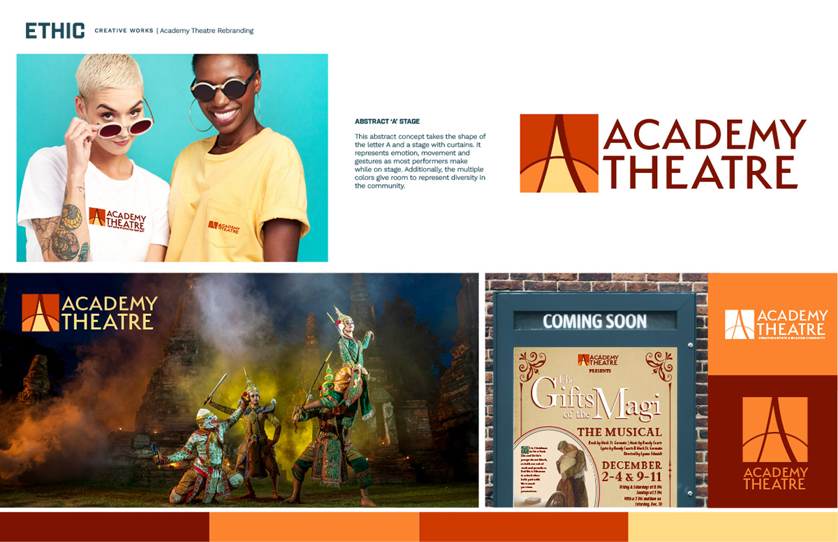
EARLY CONCEPT: ABSTRACT 'A' STAGE
An early direction combined the letter A with the shape of a stage framed by curtains. It was meant to suggest the emotion, movement, and gestures performers bring to the stage, and a multicolor palette was explored to reflect the diversity of the theatre community. This version came before the final identity.
STYLE GUIDE
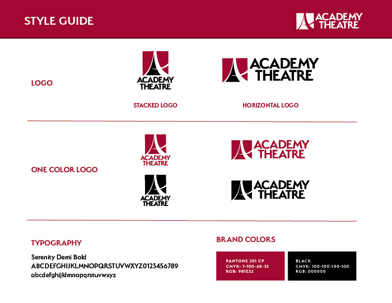
The final logo forms the letter A from a pair of stage curtains. The style guide shows the stacked and horizontal logos, the one-color versions, the brand typeface (Serenity Demi Bold), and the brand colors: theatre red and black.
MOCKUPS
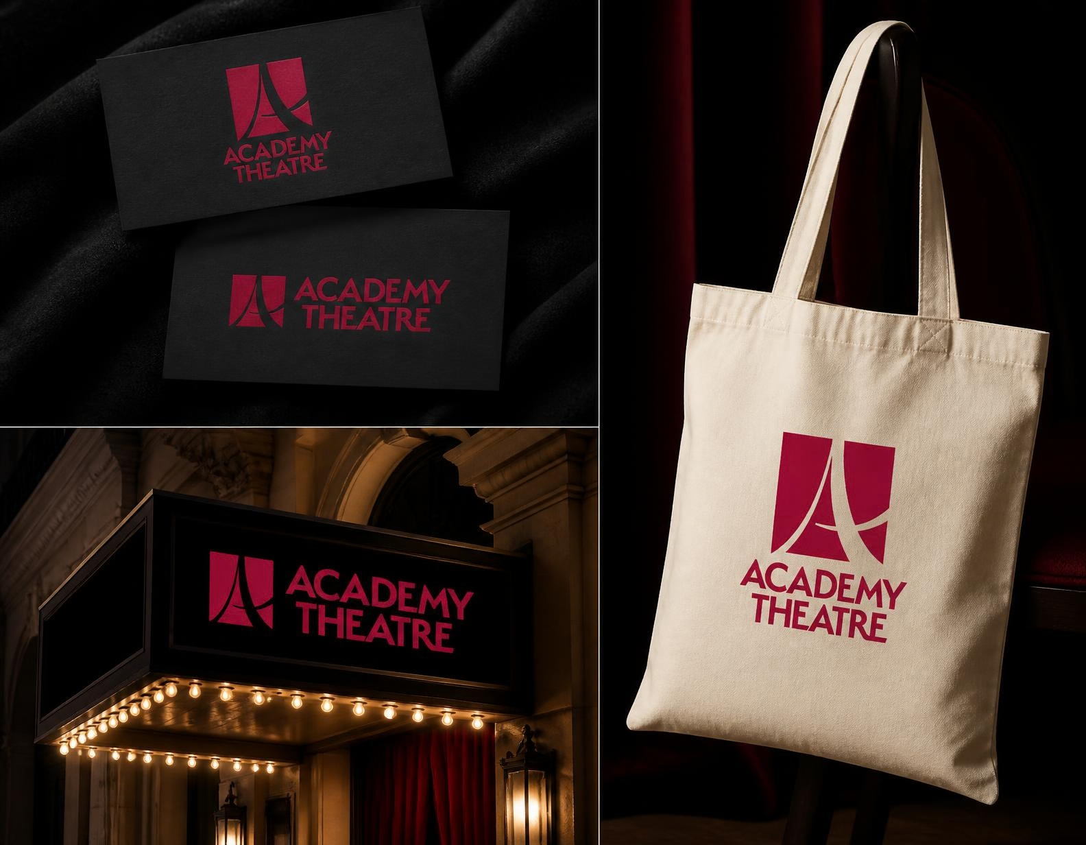
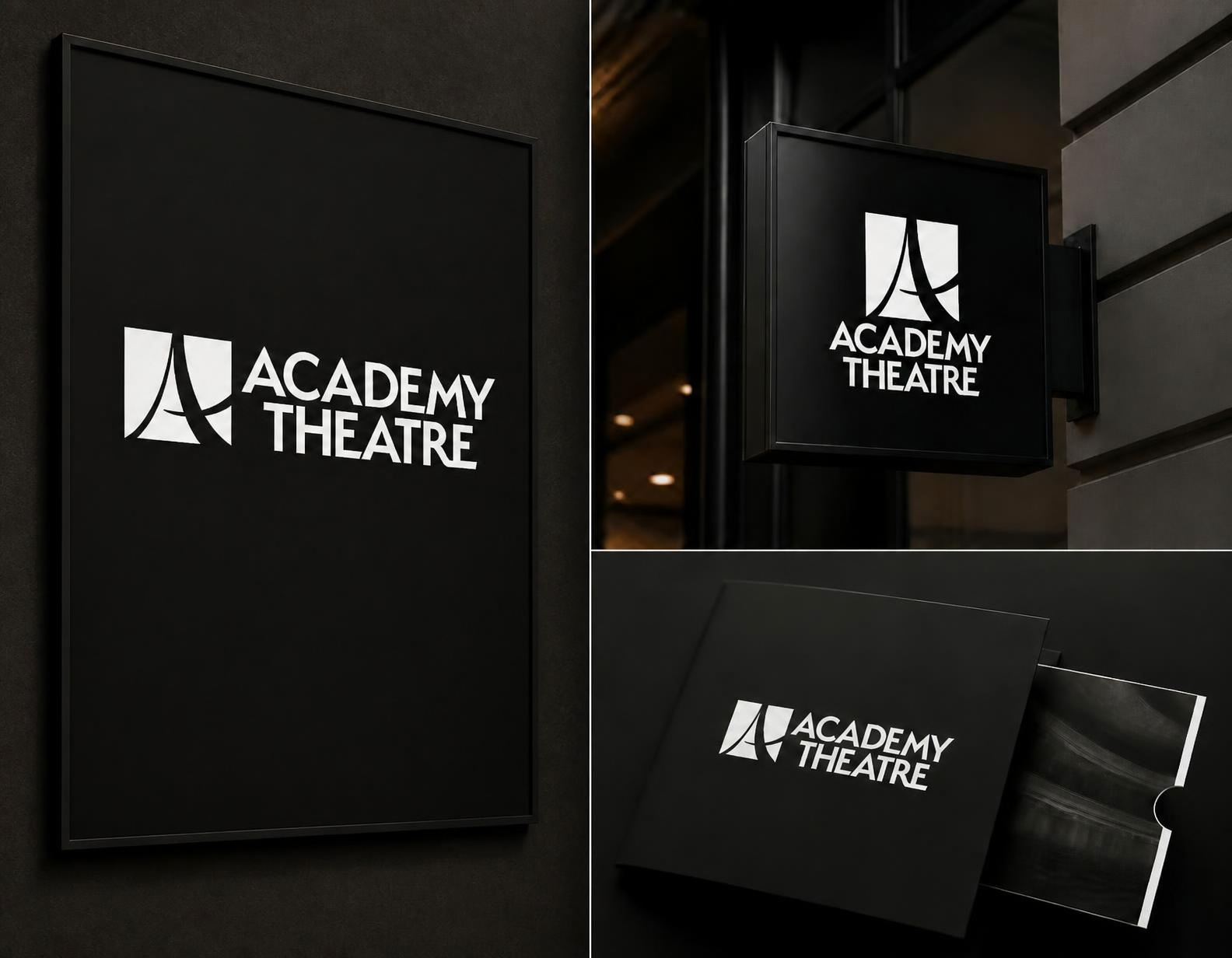
Mockups showing how the identity carries across business cards, a tote bag, signage, and the theatre entrance.